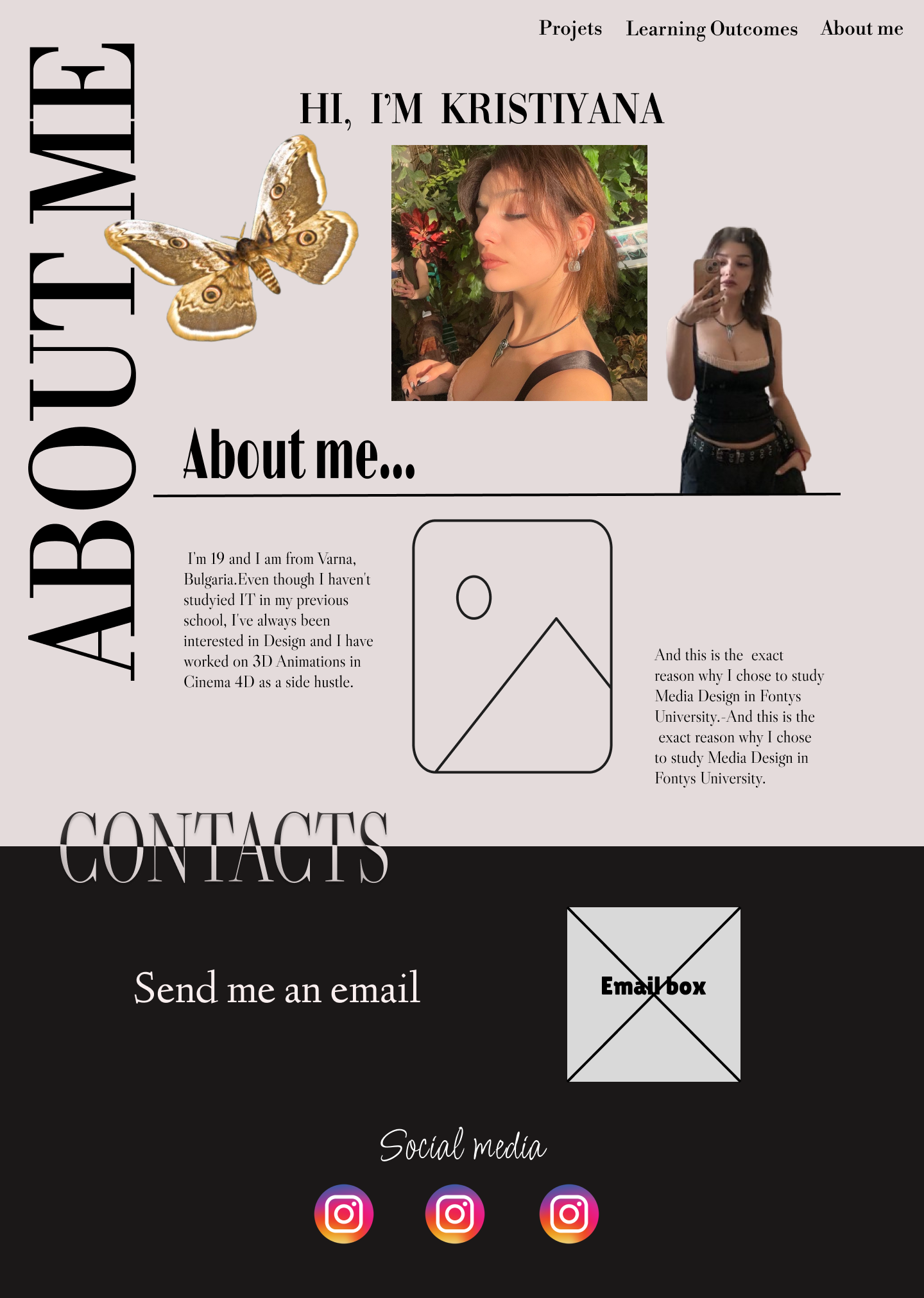
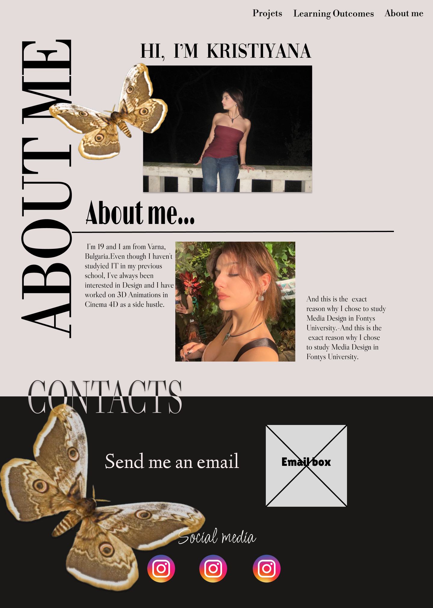
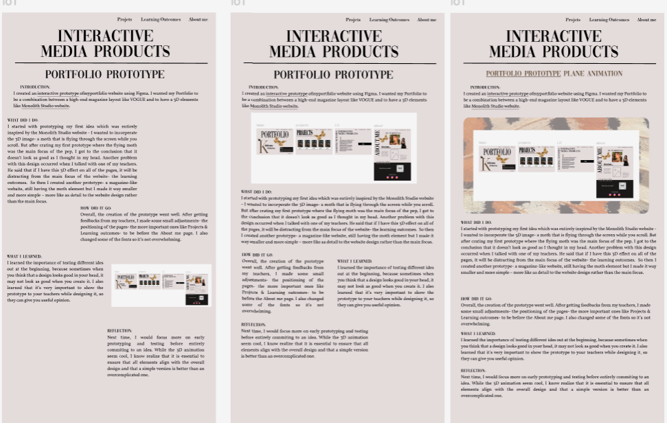
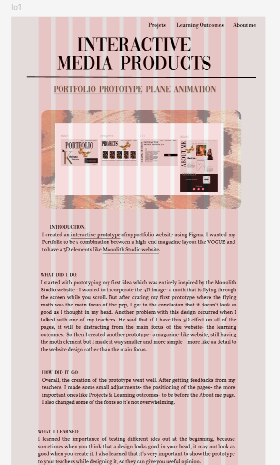
Introduction:
For the branding project we had to create logo for our client Dana. To ensure having as many iterations as possible all of us created many logo design before choosing the best final products from all to send to our client.
What did I do:
Using Figma, I focused on creating logos with various style options since the idea of the logo is to present our client’s persona the best way possible and to match her style and brand. Additionally, I worked with the client’s branding colors- different shades of dark purple and explored how these colors would work together in the best way possible to match her brand.First I created this logo together with a teammate which Dana liked quate a lot, but said she wouldn’t use because the font is too round:

Then I created this versions of the logo-
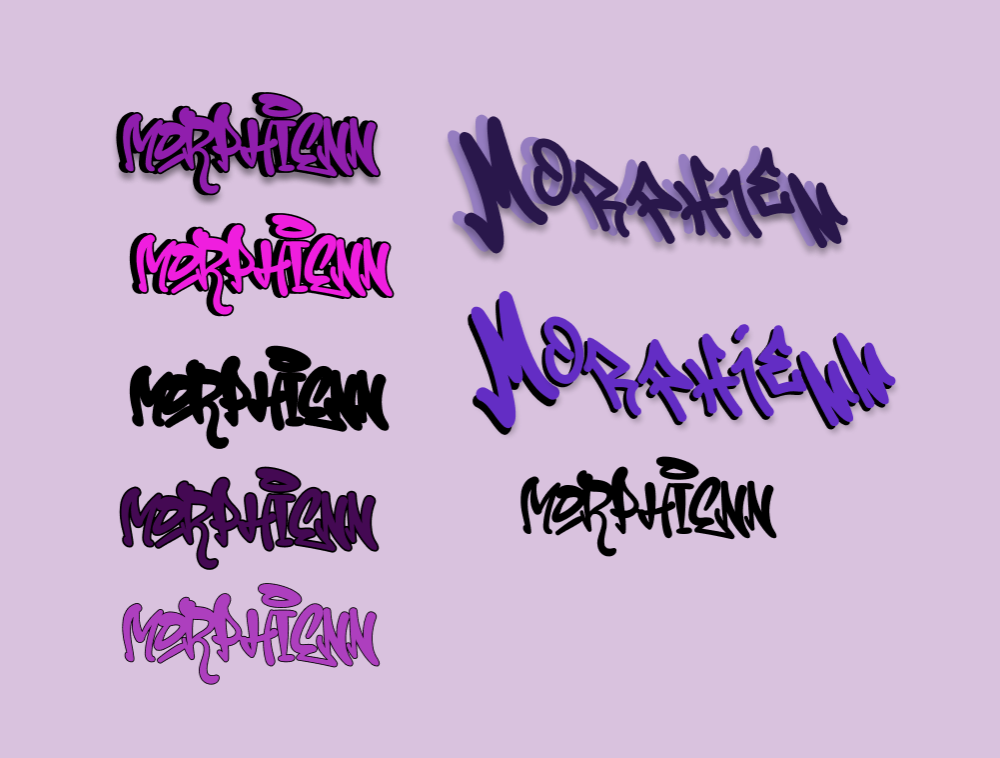
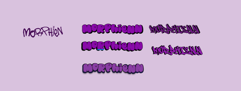
But after consulting with my teammates I got a feedback from them that the logos are not really following our clients style and are very graffiti like.
I also tried to use the chemical formula for morphine since that’s where the logo’s name comes from but they didn’t really worked out how I wanted them to:

Dana’s brand follows a creepy and disturbing aesthetic and a cyberpunk style. To match to this, I focused on using sharper and more angular fonts and experimented with the positioning of the letters to capture the unsettling nature of her style. I also tried out different font effects to achieve the futuristic look of the cyberpunk.
\
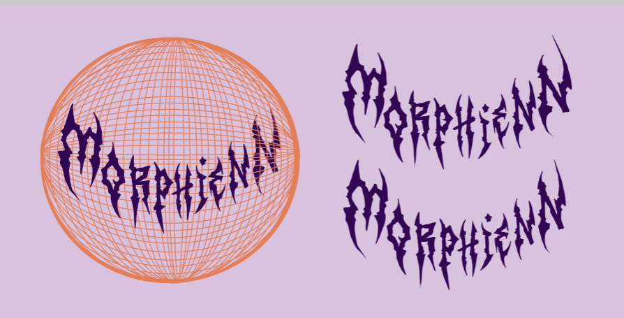
One of my teachers gave me feedback that he likes this version because the sharpness of the letters match Dana’s aesthetic, but I didn’t really like the font I used so I decided to keep the sharpness but use other fonts:
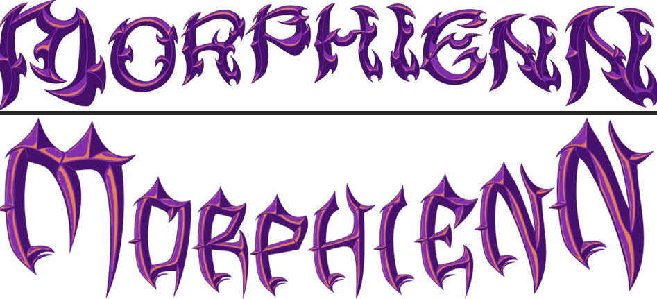
Both my teachers and teammates were satisfied with these products and my team and I decided to send them to Dana.
How did it go:
At the beginning, I found a difficulty in creating logos that represented Dana’s style it was way different than my personal style and I lacked inspiration to work on them. But after studying the cyberpunk aesthetic I understood better how to blend this theme with the logo design.
What I learned:
By working on the logos, I learned the importance of understanding the client’s vision and that sometimes you have to leave your comfort zone and challenge yourself to do something different. Working with one specific style choice and a set color palette pushed me to think more creatively and outside the box. The process also made me realize the importance of creating different iterations, because with the more iterations I created, the more opportunities I had to improve the design and create a better version of the logo.
Reflection:
Next time, I would try to get more feedback from my client and my teammates to ensure that I am going in the right direction. I would also try to be more open minded and I would try to do different styles even if they are not something familiar to me.