Introduction:
For the branding project, I focused on applying professional practice by conducting exploratory research in the form of interview.
What did I do:
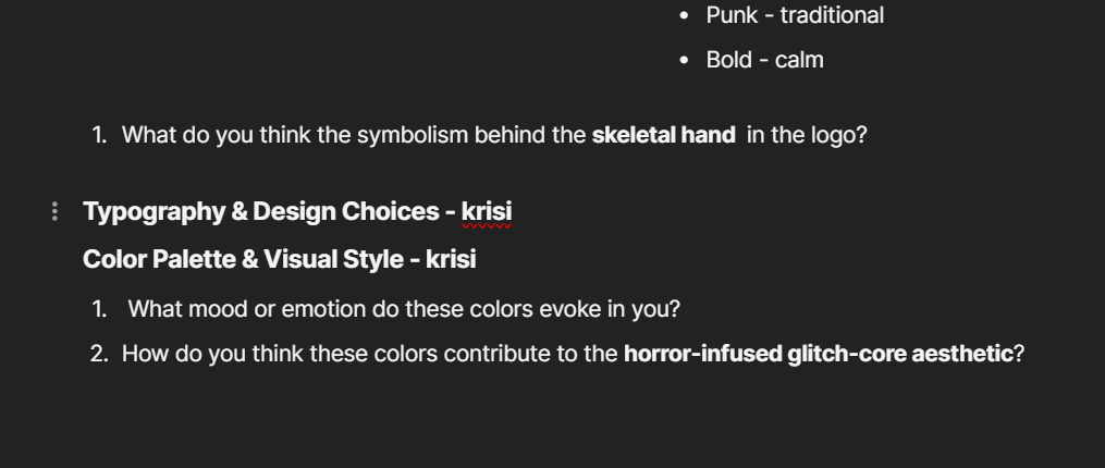
The interview’s goal was to gather insights into our client’s – Morphienn brand identity vision and aesthetic. I contributed to the research phase by developing interview questions related to the typography, the color palette of the brand and the brand evolution. Some of the questions I wrote were focused on understanding the symbolism of the logo and the Morphienn’s aesthetic. By this questions, we can gain insight on how her brand is perceived by the pothential audience
How did it go:
Even though we haven’t conducted the interviews yet, after showing the interview questions to our teachers, I received a valuable feedback. Some of the questions had to be changed a bit so they are clearer and easier to understand by the people that we will interview.
Reflection:
I learned the importance of clear communication with the interviewee and that it is crutual to ask the write questions of you want to receive as useful answers as possible. I also learned that conducting interviews while working on the branding because this people might be the pothential audience to our client and their opinion is very important. Knowing that the users like and what’s their point of view will help the brand identity to improve.
Introduction:
For the UX project, I applied professional standard by conducting a Competitors analysis for our clients’ platform.
What did I do:
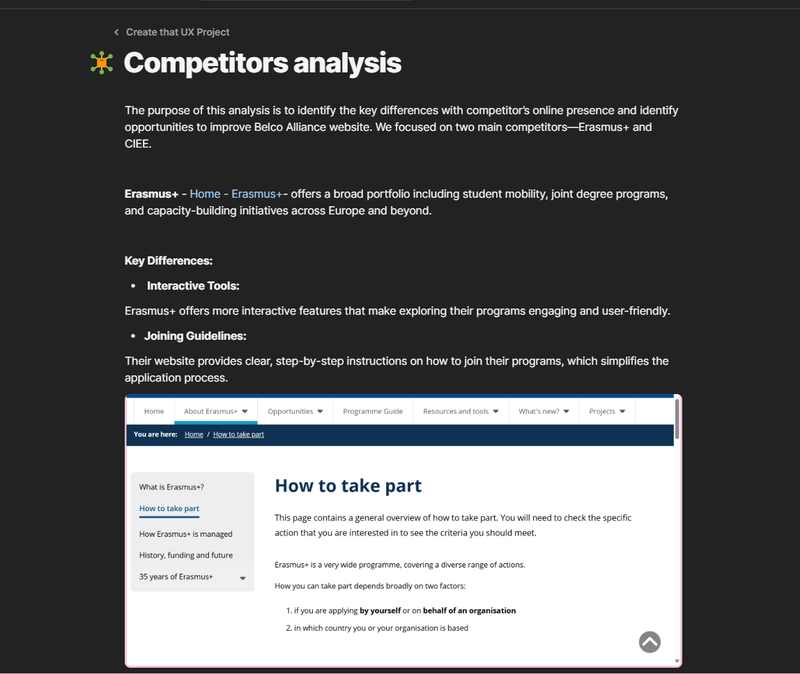
First, I started by searching other big platforms which offers similar programs to our clients’ one. After identifying two main competitors— Erasmus+ and CIEE, I looked through their websites and online presence to see what features they offer and what design they have. At the end, I collected data from the two websites in comparison to Belco Alliance website, and I highlighted the key differences that they have.
How did it go:
The process went smoothly and it was also very helpful in understanding what our clients’ website lacks on and how we can improve it. Styding these two sites, I found out what are the current trends in that platforms, what features are the most useful and the most interesting to the client and what my team and I have to do to fix the Belco Alliance website.
What I learned:
I learned the importance of making a research of competitors and how useful it can be for the whole project. By studying similar platforms, I was able to understand current trends and designs and what kind of features the end-user expects to see. This helped me get a better idea of what works and what not in this industry. It also gave me a clear direction on what we should do to deliver a working and well-designed website by looking at already successful examples.
Reflection:
Next time, when I do competitor analysis, I would collect data from more platforms, to get a broader overview.
Introduction:
For the UX project, I conducted an exploratory research in a form of interview with a student to gather more data on what students would want to see at Belco Alliance website.
What did I do:
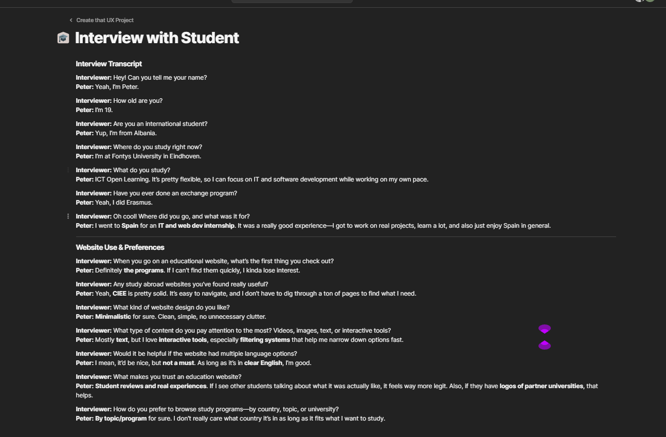
I took the initiative to find a student who fits the target audience and organized the interview myself. I explained to him the purpose of the interview and we scheduled a time for it. For the interview I used the interview questions written by my teammate but also I asked the students some additional questions while interviewing him so I can collect fuller data.
How did it go:
I am satisfied with how the interview went since I managed to gather very valuable for the project information. The student shared insights on what users like him look for in an educational platforms. He said that the most important thing in one website of this kind is to be easy to navigate and to be able to find quickly the programs. Overall, the interview gave my team and I clear directions on what we should do to make Belco Alliance website better.
What I learned:
What I learned from this experience is how valuable it is to talk with a real user who fits the target audience. In that way, you gain valuable data on what the pothential problem is and how to improve the current situation.
Reflection:
I found out that I really like conducting interview so I would definitely take the initiative to conduct them in my next assignments. Next time, I would also make sure to interview more people so I can have larger range of answers.
Introduction:
I conducted a user-testing to get a better understanding how would a potential user perceive my portfolio website. The goal was to gather insights from a third perspective regarding if my website is user friendly, if some of the features are confusing or overwhelming.
What did I do:
I started by writing questions to gather information about the visual, design, the animations, usability and navigation flow. I asked the participant to guide through my website by themselves and screen recorded the process. Then I asked the user questions about their first impression, the layout, colour palette, the ease of navigation, the animations and areas of improvement.
How did it go:
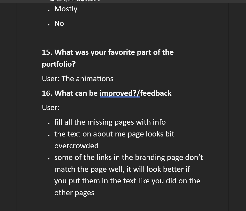
The testing provided useful data about how my site is perceived from a user point’s of view.Overall, the feedback I got was positive- the user considers my portfolio for visually appealing and likes the animations. I also got some valuable feedback on what should I improve – inconsistent linking methods, overcrowded text on the “About me” page and a miss of CV.
What I learned:
Through the process, I learned the importance of user feedback for developing of my website so it can be user-friendly and visually pleasing. I also realized that small problems like using different link styles can interfere with the user’s experience. I would use the collected feedback for improvement of my work.
Reflection:
For the future, I want to do testing with more people so I can gather a wider set of insights. I would also conduct user-testing in earlier parts of my development for example when my prototype is done, so I now from the start if there are any issues with my layout and design.

pic. 1
pic. 2
pic. 3
Introduction:
During the Development project me and my teammate decided to add more animations to the Belco Alliance website to make it more engaging for the user. But since animations can effect usability in a bad way if they are used incorrectly, we had to conduct user-testing first.
What did I do:
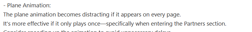
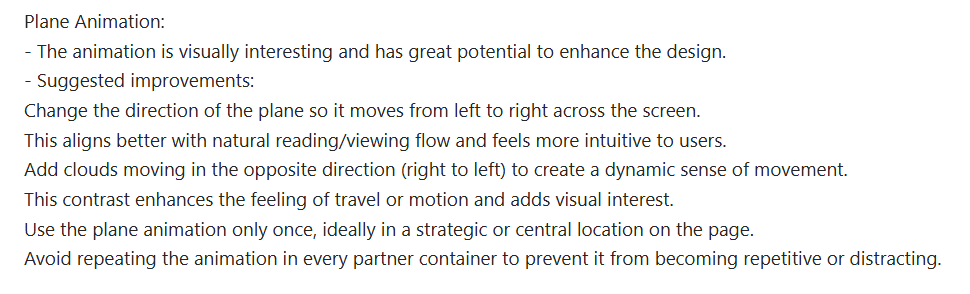
In Figma I made two variations of the animation. The first variant was of a plane flying across the exchange modules page when a card box is clicked, which then opens another page.The second one , activated again when a card box is clicked, was for a plane to pull up the exchange modules page and in that way to show the new page into a view. I then presented how both of the versions work to three teachers one by one and asked them questions regarding the functionality of the animation, if it’s too distractive and which one of the animations suits the website better.
How did it go:
The collected data was very diverse. One of the teachers found both of the animations for too distracting and time consuming. While the other two liked the animations they also agreed that the animations can get too distractive. So the conclusion was that the animations can be too much for the user if showed repeatedly. Based on the feedback -(pic. 1, pic.2, pic.3), I adjusted the animation so it shows only once- when the exchange modules page is loaded. This allowed us to still keep the animation while improving the user experience.
What I learned:
The user-testing helped my teammate and I to choose which animation to use to provide a good user experience. Based on the test, we decided to implement varian 1 but use it only once when the page loads. I also learned the importance of conducting a user-test with multiple people- this gets a broader set of insights and can help with identifying usability issues. It also shows that even if one of the users don’t like the idea, if most of the other people tested like it, that means that you shouldn’t give up on it.
Reflection:
The user-testing process showed me how important it is to test interactive elements with real users, especially when this features would have an effect on the overall experience. I learned to accept and work wit a feedback, even if its negative and it’s not the response I expected to get. The user-testing helped with the improvement of my idea and finding balance between what I made and what would be the best for the users, since their opinion is the most valuable. Next time when I am conducting a user-testing, I would keep staying open-minded for the different opinions and I would try to get more people from different age groups to test so I get more diverse feedback.
Introduction:
As a final phase of the Development project, we had to present the website we created to our clients.
What did I do:
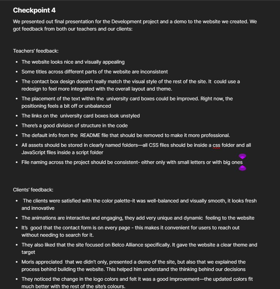
During the presentation,I was responsible for introducing our team and presenting the design choices we made for the website. I explained the reasoning behind our layout and the animations that we chose to include. After that, when it was time for demo, I showed the specific parts of the website that I developed. When the presentation was done the clients gave us feedback on the website and I took the initiative to take notes. After showing our website to our teachers as well, I wrote summary of the feedback from the clients and from the teachers.
How did it go:
The presentation went well and the clients were very satisfied with our work.But after talking with our teachers I found out what our projects lacks on.
What I learned:
During the feedback time from the teachers, I learned that on some places my design doesn’t match the overall layout. They also pointed out that the project needs improving on the file organization and on the README file so they look more professional.
Reflection:
This experience taught me a lot about presenting my work in a professional setting and being open to constructive criticism. Now I see how important it is to pay attention to small details like using the same font size all over the pages, and how this can effect the overall design. Moving forward in the future, I would apply what I learned from this project to create more consistent projects.
Introduction:
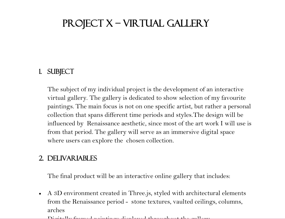
As part of developing my Virtual Gallery, I created a detailed project plan to guide the process from start to finish.
What i did:
I wrote project plan that included the following elements: subject, deliverables, learning outcomes, development phases, risks, and contact details. I broke the project down into weekly phases to manage my time effectively and clearly define when each part of the gallery should be completed. I also listed the tools I planned to use, such as Three.js, HTML, and CSS. I showed my plan to one of my teachers and he suggested that I should also include potential risks in the project plan, so this is what I did.
How did it go:
Creating the project plan gave me a strong foundation for the entire project. It helped me stay focused and follow a logical structure as I moved through different stages..
What did I learn:
Through this process, I learned how to write a well-structured project plan and what it includes. I also learned how valuable a project plan is in maintaining professional standards. It keeps the work focused, realistic, and achievable.
Reflection:
Writing the project plan pushed me to think like a professional rather than just a student. It helped me organize my ideas, define realistic goals, and stick to a structured development process. In the future I would try writing more detailed project plans and would try to describe the subjects in more professional way.
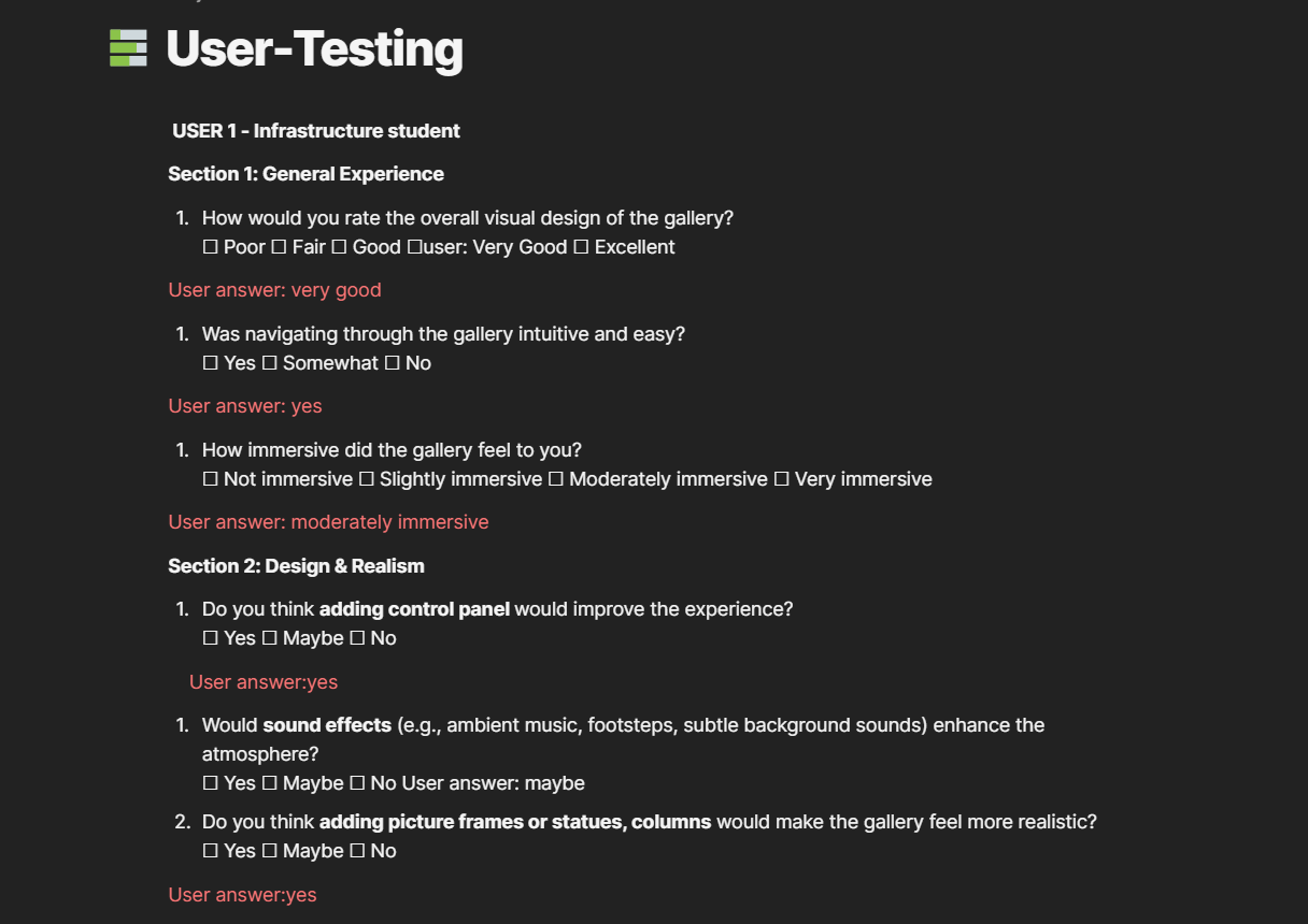
Introduction:
I conducted a user testing to get insights on how a potential user would interact with and perceive my virtual gallery. The aim was to collect objective feedback on the visual presentation, interactivity, and overall user experience to help improve both functionality and design.
What did I do:
I created a user testing form divided into four main sections: general experience, design and realism, interactivity, and overall feedback. I conducted the user-test with 2 participants- one who studies media design and one who doesn’t. I asked them to explore the virtual gallery and respond to the questions about layout, navigation, realism, and interactivity. I also collected suggestions for optional features to understand what users might expect in a more immersive experience.
How did it go:
The user tests gave me valuable insights into how people experienced the virtual space. Both users responded positively to the overall visual designs. Navigation was described as intuitive, and the lighting was seen as balanced. However, users pointed out some clear areas for improvement: the info box font was difficult to read, the positioning of the text made it less visible, and the ceiling design felt unrealistic. Both users also preferred only the red-colored walls and suggested adding features such as 3D elements or subtle ambient sound for a more immersive environment.
What did I learn:
This process highlighted the importance of user perspective, especially when working in interactive 3D environments. I also learnt that is good to have a variety of participants- testing a person who is in media design field and one who is not gave me a broader set of data.
Reflection:
In response to the feedback, I began implementing improvements: simplifying wall color to just red, changing the font and styling of info boxes, redesigning the ceiling to make it more realistic, added frames to the paintings and columns to make the gallery looks more real. I also added a background music to enhance immersion. For future projects, I would try to do user-tests in different stages of development. This would allow me to make more informed design decisions and deliver a more improved and user-friendly result.
Introduction:
Even though, Project X was individual project, I wanted still to have everything organized.
What did I do:
To do that, I created Coda workplace where I gathered everthing related to my project. In this workplace I included my project plan, a MoSCoW analysys, Page with the design choises like Moodboard and Figma, a Trello board where I tracked my tasks, my user-test questions and a user-test summary and a link to my Git repository.
How did it go:
Using both Coda and Trello worked really well for me. It helped me stay focused and organized by having all of my documentation in one place. I didn’t have to waste time looking through different apps or folders to find what I needed- which also saved time. Trello helped me prioritize tasks and stay on track, using it help me make sure that I won’t forget what I have to do.
What did I learn:
Keeping organized documentation not only made the project smoother but also made it easier to reflect on my progress and work easier.
Reflection:
Looking back, I’m glad I treated this solo project with the same organizational as I would in a team one. The structure I built helped me stay on top of my tasks and gave me confidence in the direction I was heading. I think that tools like Coda and Trello would become a big part of my workflow in the future, as it’s a good training for working in a professional environment.